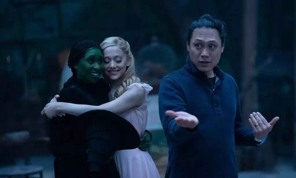
In the transition from stage to screen, adaptations of beloved stories often invite scrutiny from devoted fans. Such has been the case with Jon M. Chu’s rendition of *Wicked*, a film that has revitalized the iconic world of Oz while sparking conversations about its visual representation. Amidst a mix of celebration and critique, Chu addresses the film’s distinct color grading and aesthetic choices, which diverge from the vibrant palette of the classic 1939 film, *The Wizard of Oz*. This deviation has led to discussions online, where audiences have expressed varying opinions on the film’s “desaturated” look.
Chu’s approach to the color grading of *Wicked* stems from a desire to create a sense of realism within an essentially fantastical world. In an interview with *The Globe and Mail*, the director emphasized that he aimed to make the land of Oz feel tangible to viewers. For Chu, it was crucial that the environment reflects the emotional journey of the characters, particularly the relationship between Elphaba and Glinda. By grounding the visuals in a more subdued palette, he hoped to immerse audiences in a world where the stakes feel genuine and the characters’ experiences resonate as profoundly relatable.
The prevailing philosophy behind Chu’s aesthetic choices centers on authenticity. He contrasts the timeless allure of technicolor with a more nuanced approach to color, one in which the imperfections and textures of Oz are accentuated rather than masked. The director articulates this vision by stating, “I want to feel the dirt.” This statement encapsulates his intent to showcase Oz not simply as a whimsy-filled fantasy realm, but as a place filled with depth, history, and emotional weight.
Such a perspective challenges conventional musings about color in film. Instead of opting for flashy visuals that might distract from character development, Chu seeks to connect viewers to the environment in which the characters live. By prioritizing a realistic depiction, including elements such as backlighting and a palette that some might deem “drab,” he invites audiences to engage with the layers of the narrative on a deeper level, one that ultimately enriches their understanding of Elphaba and Glinda’s complex relationship.
Debate over the film’s aesthetic has persisted leading up to and following its theatrical release. Many fans of the original story showed mixed sentiments about the calculated decision to embrace a more understated color scheme reminiscent of reality, rather than reveling in fantastical hues. Some viewers took to platforms like X (formerly Twitter) to voice their dissatisfaction, citing the film’s visual choices as being less captivating than the vibrant technicolor of its predecessor. Conversely, supporters highlighted the significance of these choices in enhancing the film’s narrative structure and emotional arcs.
However, Chu remains unflustered by the criticism. He acknowledges the discontinuation of traditional technicolor techniques and the impossibility of perfectly replicating its aesthetic, given technological constraints and budgetary considerations. Instead, he employs natural light and sprawling landscapes to tell his story, reinforcing the connection between the land and its inhabitants as central to the film’s thematic exploration.
Despite the critique surrounding its visual approach, *Wicked* has made remarkable strides at the box office, shattering records along the way. Featuring a star-studded cast, including Ariana Grande and Cynthia Erivo, the film has achieved significant milestones such as the largest domestic and global opening for a film adapted from a Broadway production. The figures reflect a strong audience connection that transcends visual differences, illustrating that engaging storytelling and character growth can triumph over visual aesthetics alone.
The film also adds to the growing cultural dialogue regarding adaptations of established properties. With *Wicked* serving as the lens through which new aspects of Oz are examined—particularly through the eyes of its protagonists—viewers are forced to reevaluate their perceptions of these characters’ motivations and connections to one another.
Jon M. Chu’s *Wicked* presents a bold reimagining that balances respect for its source material while also seeking to redefine narratives through a contemporary lens. As discussions surrounding its visual style continue to unfold, it affirms a crucial tenet of filmmaking: the power of storytelling prevails when it resonates authentically with an audience.

Leave a Reply